Our Golden Font: Crafting TT Neoris Neo-Grotesque
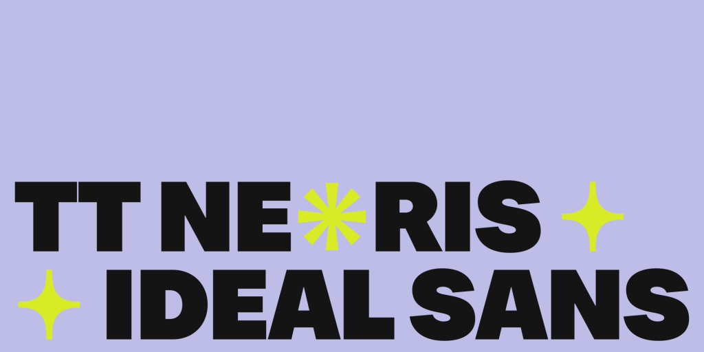
TT Neoris is our latest neo-grotesque typeface that seamlessly combines modern aesthetics with timeless legibility. Inspired by the classics yet designed for contemporary use, TT Neoris embodies the clean, functional lines characteristic of the neo-grotesque style. This font is crafted to cater to a wide range of applications, from digital interfaces to print media.
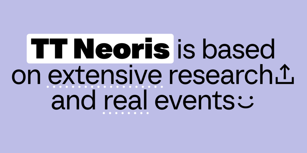
Step One: Market Research
The first step in our process was to address a crucial question: why did we need to conduct market research, and what were our goals and objectives?
Our TypeType team, driven by a passion for typography, aimed to discover the “formula of love” in the font world. We sought to determine if it was possible to design a bestseller through meticulous research and analysis. Our goal was to replicate the success of our most popular typefaces, TT Norms Pro and TT Commons Pro, by understanding the factors that contribute to their high demand.
While we have conducted research in the past, this initiative was our most thorough and comprehensive to date.
As noted by Ivan Gladkih, CTO and co-founder of TypeType: “Font popularity is largely a matter of chance—something we’ve observed firsthand. When we launched TT Norms Pro and TT Commons Pro, we were surprised by their global success. This time, however, we approached the concept of creating an ‘ideal font’ with more awareness. We clearly defined our objectives and committed fully to our research.”
Antonina Zhulkova, Design Lead at TypeType, echoed this sentiment: “We were eager to see if our research methods would yield results. Our objective was to create a bestseller, and we took every measure to achieve that. But would it work? Could we truly predict a font’s popularity? At the outset, we didn’t have those answers.”
As previously mentioned, our research was extensive. It involved analyzing a wide range of bestselling fonts, from iconic typefaces with historical significance to the latest hits in the industry. Our “test subjects” included fonts from the Monotype collection as well as those created by independent type foundries. This thorough analysis aimed to uncover the elements that resonate with designers and end-users alike, ultimately guiding us in our pursuit of crafting a successful new typeface.
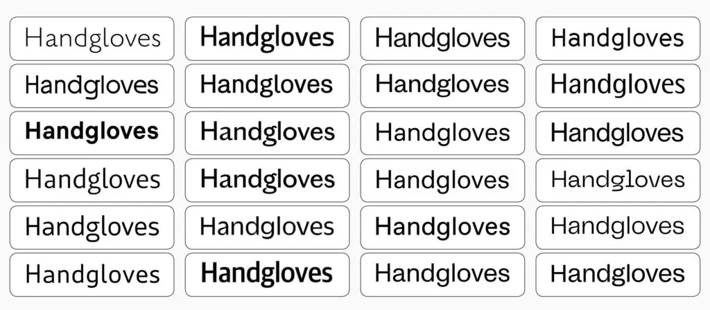
We meticulously examined every possible font parameter, deconstructing nearly all characters and their constructions. Our analysis covered various font types and components. Additionally, we engaged users to gather insights on their font preferences and identified gaps in existing offerings.
The user survey included both open-ended and closed-ended questions. For instance, we invited respondents to share their favorite fonts along with brief explanations of why they liked them, giving us valuable qualitative data.
Throughout our research, we focused on several key objectives:
- Defining Popular Font Groups: We identified the most sought-after font categories, such as geometric, humanist, and mechanistic—specifically targeting Neo-Grotesque typefaces and their relatives.
- Historical Prototypes: We sought to pinpoint the foundational historical prototypes that underpin many of the bestselling fonts.
- Attractiveness Factors: We explored what characteristics make fonts appealing, examining various design aspects such as:
- Proportions: static versus dynamic
- Width: narrow, regular, or wide
- Aperture: closed, open, or semi-open
- Contrast: high, low, or none
- Cuts: vertical, horizontal, or diagonal
- Ovals: squared, standard, or rounded
- Italics: simple cursive or authentic
- Character: brutal, soft, or neutral
- Letter constructions: single- or double-story for letters like “a” and “g”
- The letter “l”: straight or with a hook
- Distinctive graphics: presence or absence
- User Preferences: We inquired about the features that influence font purchasing decisions, including whether a font should share characteristics with others, the necessary languages and extra characters, the importance of variable fonts, and any flaws they perceive in existing typefaces.
- Character Set Analysis: Finally, we analyzed the number of font styles and deconstructed the character sets of bestselling fonts to understand their composition better.
After completing our research, we established initial starting points for our project. However, several questions arose regarding the interpretation of the data we collected. We needed to determine which findings would serve as the foundation for our design and how to effectively implement these insights. This marked a crucial phase in the process, as we began to define the fundamental characteristics of our new, yet-to-be-named font.
Step Two: Result Assessment and Conclusions
To move forward, we first needed to categorize the type of font we aimed to create. Our research identified two leading categories: geometric and mechanistic (Neo-Grotesques). An analysis of bestselling fonts on the prominent marketplace MyFonts revealed that geometric typefaces, such as Futura, were among the most sought after. However, the broader trend indicated that Neo-Grotesques, like Helvetica, ultimately held the top position in popularity.
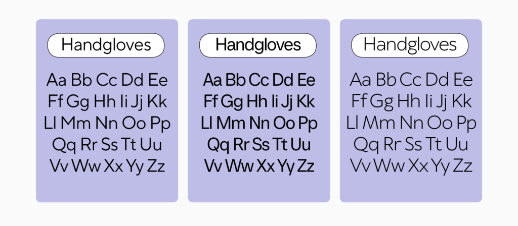
Based on the research findings, it became clear that if we aimed to create a bestseller on MyFonts, a geometric sans serif might be the way to go. However, insights from user and independent font foundry surveys pointed towards the superiority of designing a Neo-Grotesque font. Additionally, our studio did not have a Neo-Grotesque representation, and there is a noticeable scarcity of high-quality Neo-Grotesque fonts in the market, especially for Cyrillic alphabets.”
— Antonina Zhulkova, Design Lead at TypeType
This realization led us to commit to designing an original Neo-Grotesque font that would set trends rather than merely follow them. The research was instrumental in guiding this decision.
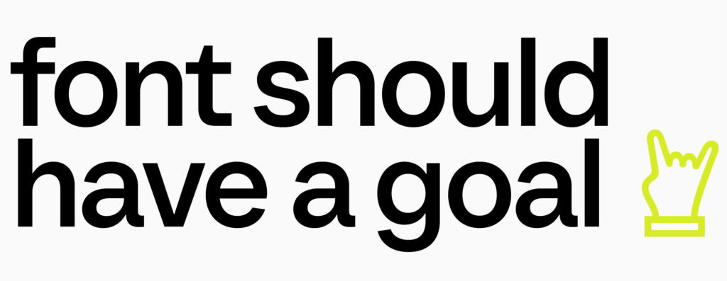
“One particular response from a survey participant resonated deeply with the entire team: ‘A font should have a goal.’ This insight made it clear that our Ideal Sans would not be just another Helvetica; it was meant to offer a fresh perspective on the future of Neo-Grotesques.”
— Antonina Zhulkova, Design Lead at TypeType
Following our research, we needed to determine the mood our typeface would express. The findings indicated a preference for neutral designs, with respondents favoring softer aesthetics over more aggressive styles. This neutral character became a crucial reference point for our development. However, we also aimed for our typeface to possess a vibrant personality—one that is both unique and contemporary.
The survey insights revealed that the primary criteria for purchasing a font include its overall design and the availability of a comprehensive font family. Functionality was another significant aspect, emphasizing the need for numerous OpenType features, additional glyphs, and extensive language support. These parameters, identified in our research, would be integral to the features of our new font.
“This research transformed into a complex technical assignment for us, akin to working on graph paper to fit our font’s original design. Each adjustment was restricted, as nearby fonts from other categories dictated strict parameters. Changes to widths or weights were not permissible, and the grid constrained our creative expression. Yet, our primary task remained clear: to design a unique and innovative typeface. This challenge significantly extended our timeline for completion.”
— Ivan Gladkih, CTO and co-founder of TypeType
With the extensive research phase behind us, we were now ready to embark on the next exciting chapter: creating the ideal Neo-Grotesque. However, our search for answers continued as we engaged in additional mini-studies throughout the font development process.
The project ultimately required 2,900 hours of dedicated work, during which we meticulously refined every detail and introduced new features, such as a special italic style and alternate glyph shapes (which will be discussed later). The inclusion of both Cyrillic and Latin character sets significantly increased the number of glyphs, adding further technical challenges.
Crafting Process: Where Every Letter Matters
Our font creation followed a well-established approach. Initially, designers sketched the core glyphs for both the Latin and Cyrillic scripts in regular, bold, and light styles. This step was crucial for two reasons: it allowed us to establish the extreme values (or masters) and ensured precise alignment with standardized values for the most commonly used styles, namely Regular, DemiBold, and Bold.
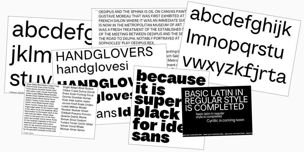
“We printed out our font sketches and compared them to those of the fonts from our research. This analysis involved laying everything out on the table to determine what worked and what didn’t. The goal was to ensure that our Neo-Grotesque font could seamlessly replace existing options without significantly altering the layout. This approach allowed us to align our values with those that users are already familiar with.”
— Antonina Zhulkova, Design Lead at TypeType
One notable feature of TT Neoris is how the boldest style (Black) maintains a level of seriousness comparable to the regular weight. While this might seem like a minor detail, it required considerable effort from our designers to achieve this harmonious effect.
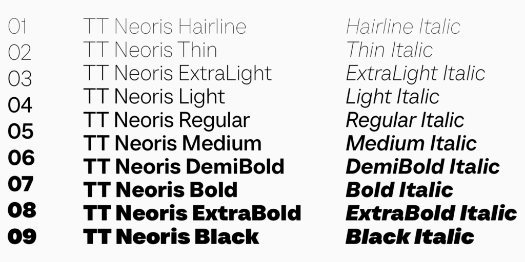
“When we started designing the bold font style, it initially had a plush appearance. Due to proportion adjustments, the font began to lose its serious tone. We had to work hard to ensure that the bold style conveyed a solid presence while still feeling connected to the regular weight. Now, we can confidently say that the bold font style stands out remarkably on its own, making a strong statement as part of our new typeface.”
— Ivan Gladkih, CTO, co-founder of TypeType

Once we established the number of font styles and their overall appearance, we began the meticulous process of designing the letters for both the Latin and Cyrillic alphabets. It was essential to consider the mood of each letter, ensuring that all details aligned with our research findings, including stroke end angles, shapes, proportions, and approaches. Following this initial design phase, we proceeded to expand the entire type family, creating a cohesive and versatile set of styles.
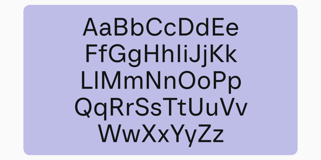
Indeed, integrating all elements into a single typeface posed significant challenges, particularly when it came to establishing the logic behind the OpenType features to ensure their proper functionality. Designers encountered technical constraints while creating alternate shapes for punctuation marks, such as periods and diacritical marks that included dots, which required careful consideration and precision.

In our typefaces, users have the flexibility to switch between square and round periods within the basic character set, as well as across all alternate stylistic sets. Each character was meticulously designed to include an alternate form; for instance, if a glyph featured a dot, it came with both a square dot and a round variant. This approach significantly increased the character count and complicated the implementation of features. We had to carefully plan how these elements would function, establishing a specific order of features that enables users to apply multiple sets and effectively access four variations instead of just one.
What’s the Recipe for the Neo-Grotesque of the Future?
The character set of TT Neoris is extensive and varied, incorporating all possible variants of figures, indices, and currencies, making it a versatile font suitable for any type of text while maintaining a stunning and balanced appearance. Additionally, we included circled numbers and arrows to facilitate creative combinations in various designs. Icons such as faces, stars, hearts, and more have also been integrated into TT Neoris, further enhancing its usability and aesthetic appeal.
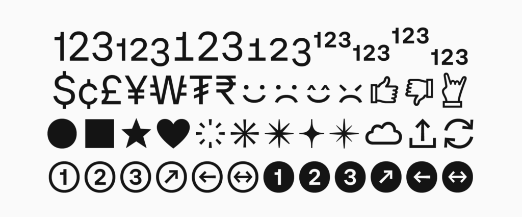
I truly enjoy creating additional graphic elements for fonts because they offer great convenience. Designers can easily utilize ready-made icons or images that seamlessly match the fonts, eliminating the need to create them from scratch,” says Antonina Zhulkova, Design Lead at TypeType.
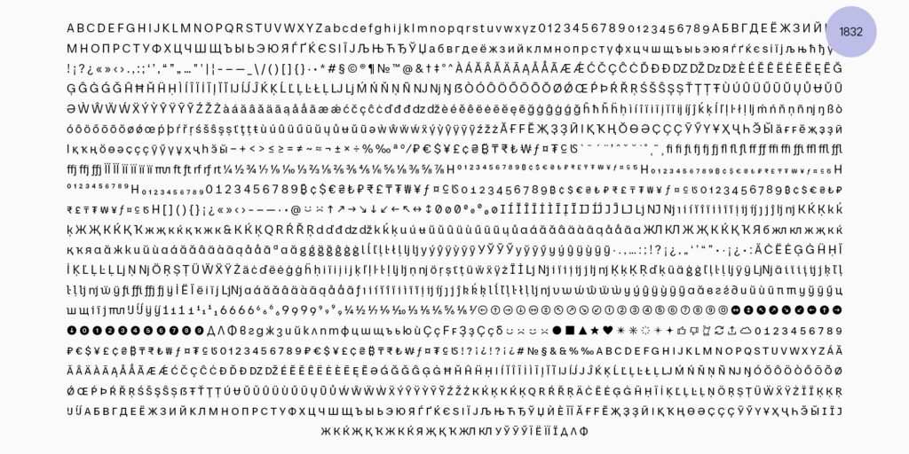
We are confident that with future updates, the character set will surpass 2,000 glyphs. Typically, only large corporations can afford such extensive character sets due to the time and complexity involved. First, there’s the design process, and then ensuring everything functions correctly from a technical standpoint. We aimed for our typeface to be exemplary in every respect, and we dedicated ourselves to making that a reality,” adds Ivan Gladkih, CTO and co-founder of TypeType.
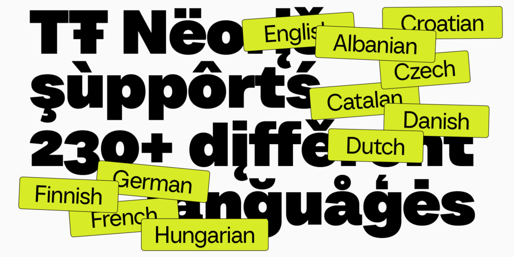
TT Neoris is designed to support over 230 languages, including all Cyrillic-based languages that have more than a million speakers. This extensive language support ensures versatility and accessibility for a wide range of users and applications.
“We always strive to satisfy our users, as we feel a sense of responsibility for the entire ‘Cyrillic font world,’” says Ivan Gladkih, CTO and co-founder of TypeType.
Innovations in TT Neoris
Our aim was to create a Neo-Grotesque typeface that remains true to its genre while incorporating contemporary design elements. We carefully analyzed each character, rethinking traditional forms to give the font a modern twist.
For instance, some shapes in TT Neoris deviate from conventional designs. Triangular characters such as A, V, and W feature broad horizontal apexes, while the Latin letter y and the Cyrillic У/у are designed without terminals, enhancing their unique, contemporary appearance.

Another interesting aspect of TT Neoris is its character spacing. While traditional Swiss Neo-Grotesques often have noticeably tight spacing, our objective was to create a multifunctional typeface suitable for various applications, including both large formats like posters and practical uses. To achieve this balance, we opted for wider sidebearings, ensuring they remain narrow enough to adhere to Neo-Grotesque standards while enhancing legibility across different contexts.

Multiple Personalities of One Font
The users surveyed during our research expressed a desire for a typeface with a neutral and foundational character. However, they also wanted the flexibility to utilize the same font for a variety of clients and tasks through multiple alternates. In response, we designed TT Neoris to offer extensive customization options, significantly enhancing its versatility.
TT Neoris is a shape-shifting font. Its neutral character can be subtly adjusted for a softer and more elegant appearance or transformed dramatically to fit a wide range of styles and applications. This adaptability allows designers to tailor the font to meet diverse creative needs while maintaining a cohesive look.

Some of the alternate characters in TT Neoris consist of different glyph forms. For example, users can choose between single- and double-story variations of the letter “a,” as well as alternative forms for the Latin letters “i,” “g,” “l,” “J,” and the Cyrillic letters “К” and “Ж.” This variety enhances the font’s flexibility, allowing designers to select the specific character forms that best suit their design needs.

It’s important to note that the Latin and Cyrillic character sets in TT Neoris have distinct design philosophies. Toma Streltsova, our Senior Type Designer, recognized an opportunity to incorporate traditional calligraphic forms into this modern sans serif.
“For the Cyrillic set, we chose a different approach than we did for the Latin set. We designed forms that are characteristic of Cyrillic calligraphy. This is particularly relevant because upright cursive can appear unusual in certain Cyrillic-based languages, as it closely resembles the Bulgarian form of the Cyrillic glyphs. Notably, TT Neoris also includes a Bulgarian variant. However, in other Cyrillic languages, the visual traditions vary significantly. Thus, we decided to honor historical influences while adapting the designs to meet contemporary requirements and trends. The result is a modern font that seamlessly blends contemporary aesthetics with historical roots,” says Antonina Zhulkova, Design Lead at TypeType.
Italic Font Styles and Upright Cursive
We devoted considerable attention to the italic font styles, designing them to be slightly narrower than their upright counterparts.
“Typically, we create slanted versions for sans serifs without altering the glyph forms. However, we’ve found that simply slanting the letters often doesn’t highlight the text effectively. To create an accentuated appearance, we applied a true italic design. This involved narrowing the forms from the lightest to the boldest styles.
I began by sketching the new designs, determining the appropriate slant angle, and refining the proportions. Interestingly, this process didn’t take much longer than crafting standard slants. Given the ambitious nature of the project, we were keen to optimize our time,” Antonina explains.
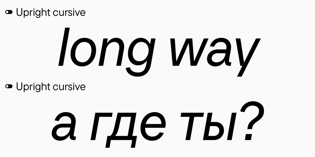
You can combine the italic font styles with the upright cursive set in TT Neoris.
“As far as we know, there are no other cursive fonts like this among sans serifs in the Russian-speaking segment. This design represents both a tribute to tradition and an exploration of future italic forms. Users can choose from familiar slanted sans serif designs as well as more historical styles,” says Ivan Gladkih, CTO and co-founder of TypeType.
TT Neoris
TT Neoris is an ultra-modern, functional, and highly adaptable Neo-Grotesque typeface with a versatile character, capable of replacing several different fonts.
Currently, TT Neoris includes:
- 21 Font Styles: 10 upright, 10 italics, and 1 variable font.
- 1832 Characters: Each style features an extensive set, including both Latin and Cyrillic characters and special symbols.
- 41 OpenType Features: These encompass localization options for various languages, stylistic alternates, small caps, icons, circled figures, and arrows.
- 14 Stylistic Sets: These include Soft characters and Upright cursive in both Latin and Cyrillic sets.
- 230+ Language Support: This includes all languages based on the Cyrillic script that have over a million speakers.
- Unique Narrow Italics: These italic styles serve to highlight text fragments, creating a soft accent without disrupting the reading experience.
Key Takeaways
- Discover the inspiration and concept behind the creation of TT Neoris, our meticulously designed neo-grotesque font.
- Explore the dedication and attention to detail that went into the typographic craftsmanship of this font.
- Understand the challenges and technical aspects involved in the development of TT Neoris, a true typographic masterpiece.
- Learn about the collaborative process and the legacy of excellence in typography that shaped the creation of this versatile font.
- Gain insights into the future of TT Neoris and the ongoing evolution of neo-grotesque typefaces in the design landscape.
The Birth of a Typographic Masterpiece
The journey to create our iconic neo-grotesque font, TT Neoris, started with a deep look into its rich history. Our talented team aimed to capture the essence of neo-grotesque fonts, which Fontshop defines as embodying clarity and functionality while maintaining a timeless appeal. They wanted to add a modern, refined touch that would last.
In this exploration, we delved into the heritage of neo-grotesque typefaces. These fonts emerged in the mid-20th century, building on the foundation laid by earlier sans-serifs like Helvetica and Univers. Their minimalistic forms and straightforward aesthetics reflect a departure from the ornate styles of their predecessors, aiming instead for readability and versatility.
Inspiration and Concept
Our designers drew inspiration from classic neo-grotesque typefaces. They studied the proportions, stroke weights, and subtle details. Their goal was to create a typeface that blends tradition and modernity, reflecting insights from Typographica about the significance of balance in type design.
As part of our research, we explored various historical type specimens, analyzing the subtleties of form that characterize successful neo-grotesque fonts. We considered the impactful designs of Adrian Frutiger and Max Miedinger, whose works have left an indelible mark on the typography landscape.
The Design Team’s Vision
Our seasoned typographic craftsmanship experts guided the team through a process of sketching, prototyping, and evaluation. This helped them refine the TT Neoris letterforms, balancing classic and modern styles, much like the approaches discussed in The New Typography.
The vision for TT Neoris was to create a typeface that resonated with designers while remaining accessible for everyday use. We emphasized simplicity without sacrificing character. Each decision, from the curvature of the letters to the spacing between them, was meticulously considered, ensuring that TT Neoris would stand out in both digital and print mediums.
Our Golden Font: How We Crafted the Ideal Neo-Grotesque TT Neoris
The making of our golden font, TT Neoris, was a true labor of love. It took countless hours of research, testing, and fine-tuning. Our team of typography experts worked hard to ensure every detail was perfect.
At the core of our work was a deep love for typography and a goal to create the perfect neo-grotesque font. We closely examined classic neo-grotesque fonts, studying their shapes, line weights, and beauty to guide our design. The outcome was a typeface that not only reflects our dedication but also serves as a testament to the timeless appeal of neo-grotesque design.
We sought to create a versatile font that could adapt to various applications, from large-scale branding to subtle UI elements. The research we conducted aligns with findings from Smashing Magazine, emphasizing the importance of versatility in modern type design.
The Art of Typographic Craftsmanship
Creating TT Neoris was a true masterpiece of typographic craftsmanship. Our skilled team focused on every detail, perfecting letterforms, kerning, and typographic rhythm for a balanced and striking look. This dedication makes TT Neoris stand out as a true achievement in font production.
Each glyph was scrutinized to ensure that it not only met aesthetic standards but also functioned optimally in a variety of contexts. As noted in AIGA Eye on Design, the psychological impact of typography is profound; we aimed for TT Neoris to evoke clarity and confidence.
“Crafting TT Neoris was a true exercise in typographic craftsmanship, where our designers left no stone unturned in their pursuit of excellence.”
Our commitment to craftsmanship was reflected in the iterations of TT Neoris. Each phase of development involved thorough testing, where we evaluated how the typeface performed across various applications. Feedback loops with industry professionals provided valuable insights, allowing us to refine our designs further.
Exploring the Neo-Grotesque Aesthetic
The charm of neo-grotesque fonts comes from their timeless beauty and flexibility. These fonts are known for their clean lines and balanced look. Our team aimed to bring this classic style into the modern world with TT Neoris. A List Apart offers insights into how these design principles apply to modern typography.
At the core of neo-grotesque fonts is a focus on simplicity and clarity. They avoid the ornate details of older fonts, choosing instead a straightforward design. This simplicity makes them elegant and versatile, fitting seamlessly into various contexts, including corporate branding and editorial design.
Our design philosophy mirrored the ongoing trend toward minimalism in graphic design. With a focus on effective communication, we endeavored to craft a typeface that facilitates understanding while remaining visually appealing. The design principles discussed in Creative Bloq inspired our approach.
The Challenges of Typeface Development
Creating a typeface like TT Neoris is a tough job. Our team of font engineers faced many obstacles. They worked hard to ensure a typeface that looks great and performs well across various applications.
Balancing Form and Function
Our team paid close attention to kerning and spacing, striving for harmony between aesthetics and legibility. This balancing act reflects insights found in The Elements of Typographic Style, emphasizing the importance of both beauty and functionality in type design.
One of the most significant challenges was ensuring that the typeface maintained its character and legibility across different sizes and mediums. We engaged in rigorous testing to analyze how TT Neoris performed in print versus digital contexts. We referenced industry standards, such as those outlined by the International Typography Association, to guide our evaluations.
Typeface Engineering: The Technical Aspects
The making of TT Neoris involved a blend of art and technology. Our team of font engineers collaborated closely with designers to ensure the font performed well across both digital and print media. Key technical aspects included character encoding and hinting, vital for ensuring a seamless user experience.
Character encoding was crucial, as we aimed for TT Neoris to be accessible across multiple languages and scripts. This compatibility ensures that designers can utilize the typeface in global projects without losing its integrity. As detailed by Google Fonts, ensuring diverse language support is paramount in modern type design.
Hinting played an equally important role in optimizing the font for low-resolution displays. Our engineers meticulously adjusted the outlines and spacing, ensuring that TT Neoris maintained its sharpness and clarity across various screen sizes. This technical expertise is essential for producing a high-quality typeface that stands the test of time.
The Typography Tradition at Our Studio
We pride ourselves on our tradition in typographic craftsmanship. For years, our skilled designers and engineers have pushed the boundaries of typography, as discussed in Creative Bloq. TT Neoris is a testament to this legacy.
Our studio has always focused on innovation and excellence in design. Each project serves as an opportunity to explore new techniques and ideas, building upon the knowledge gained from past experiences. This tradition is reflected in the craftsmanship of TT Neoris, which embodies both modern aesthetics and classic typographic principles.
A Legacy of Excellence
Our studio’s typography tradition is rooted in innovation and a relentless pursuit of perfection. Our designers continuously strive for improvement, always seeking new ways to elevate font design. This dedication has earned us recognition within the design community and led to numerous awards.
The legacy of excellence is evident in the quality of TT Neoris. As noted in The Font Bureau, a successful typeface must blend form, function, and emotion. TT Neoris encapsulates these qualities, serving as a versatile tool for designers across various disciplines.
The Versatility of TT Neoris
When it comes to typography and font design, versatility is key. TT Neoris, our acclaimed neo-grotesque font, showcases this in a unique way.
Its clean lines and balanced shapes make it ideal for various applications, from branding and advertising to editorial and digital content.
With multiple weights and styles, TT Neoris adapts seamlessly to any design context. Whether used for bold headlines or subtle body text, its consistent performance makes it an invaluable asset for designers. The versatility of TT Neoris is supported by findings from Typewolf, which emphasizes the importance of adaptability in contemporary typefaces.
“TT Neoris is the perfect font for designers who value both aesthetic excellence and functional versatility.”
As a typeface designed with flexibility in mind, TT Neoris fits well into diverse branding strategies. Companies can use it to create a cohesive visual identity across various touchpoints, ensuring their messaging remains clear and impactful. The font’s modern yet timeless design aligns with the evolving needs of brands in today’s marketplace.
Typographic Trends and the Rise of Neo-Grotesque Fonts
In recent years, neo-grotesque fonts have seen a resurgence in popularity, offering a blend of classic charm and modern simplicity. This trend aligns with the insights shared by Fontsmith regarding the importance of clarity in today’s design landscape.
Designers are increasingly gravitating towards neo-grotesque fonts due to their versatility and adaptability. The clean, no-nonsense aesthetic resonates with contemporary design principles that prioritize clarity and effective communication. TT Neoris captures this essence, allowing designers to convey messages with confidence.
The Collaborative Process Behind TT Neoris
Creating TT Neoris was a collaborative effort. Our talented team combined their expertise and vision, reflecting the teamwork principles emphasized by Fast Company.
The development process involved close collaboration between designers, typographers, and engineers. Regular brainstorming sessions allowed us to explore ideas and gather feedback, ensuring that every aspect of the typeface was thoroughly evaluated. This collective effort was crucial in refining TT Neoris into the polished product it is today.
The Emotional Connection to Typography
At the heart of TT Neoris is a deep love for typography. We believe good fonts can evoke emotions and enhance designs, as explored in AIGA Eye on Design.
Typography has the power to influence how we perceive messages and engage with content. Our team understood the emotional weight that a well-crafted typeface can carry. With TT Neoris, we aimed to create a font that not only serves functional purposes but also connects with users on a deeper level.
The emotional resonance of TT Neoris is evident in its design choices. The balance of curves and straight lines evokes a sense of stability and reliability, making it an ideal choice for brands that wish to convey trustworthiness. As noted by Type Network, typography plays a vital role in shaping brand identities, and TT Neoris excels in this regard.
The Future of TT Neoris and Our Typographic Journey
We’re excited about the future of TT Neoris, representing our ongoing commitment to typographic excellence. Our team continuously seeks to innovate and push the boundaries of font design, as detailed by Smashing Magazine.
As design trends evolve, so too will TT Neoris. We plan to expand the font family, introducing new styles and weights that cater to the diverse needs of our users. This commitment to growth ensures that TT Neoris remains relevant in a constantly changing landscape.
Conclusion
Our team has worked hard to create TT Neoris, a neo-grotesque font that combines timeless elegance with modern style. We’re excited to see TT Neoris inspire and captivate audiences, showcasing the power of typographic craftsmanship.
As we move forward, our dedication to excellence in font design remains unwavering. TT Neoris is not just a typeface; it’s a representation of our passion for typography and our commitment to pushing the boundaries of design.
FAQ
What is the inspiration and concept behind the creation of TT Neoris?
The idea for TT Neoris came from exploring neo-grotesque typography. Our team aimed to blend classic style with modern elegance, drawing inspiration from historical fonts to create something timeless.
How did the design team approach the development of TT Neoris?
The creation of TT Neoris was a detailed process involving hours of research and refinement to make it visually appealing and functional.
What were the key challenges in crafting TT Neoris?
The main challenges involved balancing aesthetics with functionality, ensuring versatility and high quality in design.
What were the technical aspects of font engineering involved in the creation of TT Neoris?
Our font engineers collaborated with designers to ensure optimal performance across various media, focusing on character encoding and file optimization.
How does TT Neoris fit into the tradition of typographic excellence at your studio?
TT Neoris embodies our studio’s tradition of pushing typographic boundaries and showcases our skill and dedication.
What makes TT Neoris a versatile font choice for designers?
Its versatility allows it to work well in various design contexts, making it suitable for branding, editorial, and digital projects.
How does the creation of TT Neoris align with current typographic trends?
The resurgence of neo-grotesque fonts reflects a trend towards simplicity and clarity, with TT Neoris providing a high-quality option for modern designs.
What was the collaborative process behind the creation of TT Neoris?
It was a team effort, with designers, engineers, and typography experts working together to bring this unique font to life.
How does the emotional connection to typography play a role in the development of TT Neoris?
Our passion for typography drove the design, as we believe fonts can evoke emotions and elevate visual communication.
What is the future of TT Neoris and your studio’s ongoing typographic journey?
We’re committed to further innovation and look forward to shaping the future of typography with TT Neoris at the forefront.

