Poppins Font Family
Poppins Font is a geometric sans-serif typeface known for its clean, modern look. Designed by Indian Type Foundry, it features a distinctive circular shape for its letterforms, giving it a balanced and harmonious feel. The font comes in multiple weights, from thin to extra bold, making it versatile for various design needs. Its geometric simplicity and even spacing make it ideal for both print and digital use, providing a contemporary touch to everything from headings to body text. Whether you’re designing a website, a logo, or a brochure, Poppins offers a sleek and stylish option with a touch of sophistication.

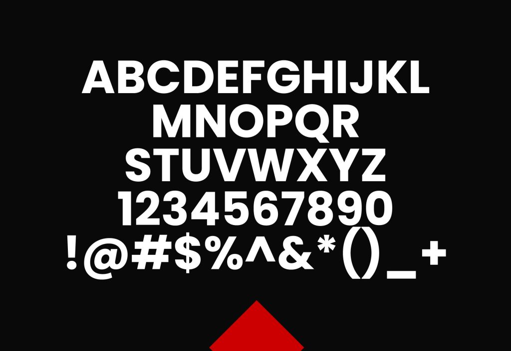
Poppins Font Basic Details
| Attribute | Details |
|---|---|
| Name | Poppins Font |
| Designer | Jonny Pinhorn |
| Foundry | Indian Type Foundry |
| Style | Sans-serif, Geometric |
| File Format | OTF, TTF, WOFF, WOFF2 |
| Date Released | 2014 |
| License | SIL Open Font License |
| Type | Typeface Family |
Usage and Applications of the Poppins Font
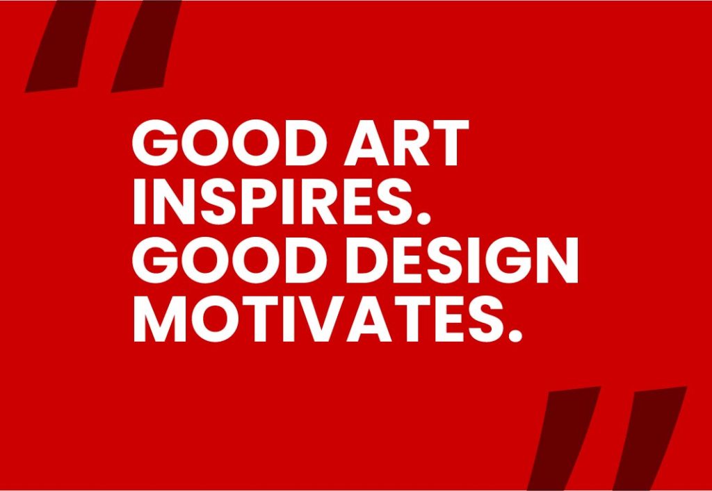
Poppins is a highly versatile font that excels in a variety of applications. Its clean and modern aesthetic makes it an excellent choice for headings and titles, where its bold and geometric design can capture attention effectively. For body text, Poppins offers excellent readability while maintaining a contemporary feel, making it suitable for both digital and print media. Its distinctive geometric style also lends itself well to branding and logo design, where a modern and professional appearance is desired. In web design, Poppins is favored for its clarity and adaptability across different screen sizes and devices. Additionally, it performs well in user interfaces, ensuring readability and a sleek look in apps and software. Social media graphics and advertising campaigns also benefit from Poppins’ stylish and clean appearance, making it a popular choice for a wide range of design needs.
Similar Fonts to Poppins:
Montserrat
- Designer: Julieta Ulanovsky
- Foundry: Julieta Ulanovsky
- Style: Geometric Sans-Serif
- Notable Features: Inspired by old signage in Buenos Aires, Montserrat features a modern, clean design with geometric shapes and a wide range of weights.
Fira Sans
- Designer: Erik Spiekermann, Ralph du Carrois
- Foundry: Mozilla
- Style: Geometric Sans-Serif
- Notable Features: Developed for the Mozilla Firefox OS, Fira Sans has a humanist touch while maintaining a geometric structure, offering excellent readability and versatility.
Raleway
- Designer: Matt McInerney
- Foundry: The League of Moveable Type
- Style: Geometric Sans-Serif
- Notable Features: Raleway features an elegant and modern design with a variety of weights, making it suitable for both display and body text.
Avenir
- Designer: Adrian Frutiger
- Foundry: Linotype
- Style: Geometric Sans-Serif
- Notable Features: Avenir combines geometric precision with humanist qualities, offering a clean and sophisticated appearance suitable for various design applications.
Open Sans
- Designer: Steve Matteson
- Foundry: Ascender Corporation
- Style: Humanist Sans-Serif
- Notable Features: Open Sans is known for its open forms and neutral design, providing excellent legibility across different platforms and sizes.
Tips and Tricks for Using the Poppins Font:
Pairing with Other Fonts:
- Complementary Fonts: Pair Poppins with a serif font like Merriweather or Georgia to create a balanced and visually appealing contrast. This combination works well for creating hierarchy in headings and body text.
- Contrasting Styles: Use Poppins in its bold or extra-bold weights for headings and a lighter, complementary sans-serif for body text, such as Open Sans or Roboto, to ensure clarity and emphasis.
Using Weights Effectively:
- Hierarchy: Take advantage of the wide range of weights in the Poppins family to establish a clear typographic hierarchy. Use lighter weights for secondary text and bolder weights for main headings and key information.
- Consistency: Maintain consistency in your design by using the same weight for similar types of text across your project. For example, if you use Poppins Medium for subheadings, use the same weight for all subheadings to keep a unified look.
Adjusting Spacing:
- Kerning and Tracking: Adjust the kerning (spacing between individual letters) and tracking (spacing between groups of letters) to enhance readability, especially in larger text sizes. Poppins generally works well with standard spacing, but fine-tuning may improve legibility in specific contexts.
- Line Spacing: Ensure adequate line spacing (leading) for body text to improve readability. Poppins’ geometric design benefits from slightly increased line spacing to avoid a cramped appearance.
Web Design Tips:
- Responsive Typography: Use media queries in CSS to adjust font sizes for different screen sizes, ensuring that Poppins remains legible and visually appealing across devices.
- Web Font Performance: Optimize web font loading by using formats like WOFF2 for better performance. Consider including only the weights and styles you need to reduce load times.
Print Design Considerations:
- High Resolution: Ensure that the Poppins font is rendered at high resolution for print projects. This will preserve its clean lines and geometric precision in printed materials.
- Contrast and Readability: Pay attention to contrast between the text and background colors to maintain readability. Poppins’ clean design performs best with high contrast against background elements.
Accessibility:
- Text Size: Make sure that text sizes are large enough for readability, especially in body text. Poppins works well at various sizes, but accessibility guidelines recommend a minimum size for body text.
- Color Choices: Use color contrast tools to ensure that your text meets accessibility standards for readability, especially if using Poppins for important information.
Conclusion
Poppins is a modern and versatile geometric sans-serif typeface that stands out for its clean, balanced design and extensive range of weights. Designed by Jonny Pinhorn and released by the Indian Type Foundry, Poppins combines geometric precision with a friendly and professional look, making it ideal for a variety of design applications.
Its broad language support, including Latin, Latin Extended, Cyrillic, Greek, and IPA Extensions, ensures that it can be used effectively across multiple languages and scripts. This makes Poppins a valuable asset for both international and multilingual projects.
Whether you’re designing for print or digital media, Poppins offers a contemporary aesthetic that enhances readability and visual appeal. Its adaptability across different contexts—such as branding, web design, user interfaces, and advertising—demonstrates its capability to meet diverse design needs. By leveraging Poppins’ clean lines and geometric structure, you can create striking and professional designs that stand out in a crowded visual landscape.
FAQS
What is the Poppins font designed for?
Answer: Poppins is designed as a geometric sans-serif typeface with a clean, modern look. It is highly versatile and suitable for a wide range of applications, including web design, print media, branding, user interfaces, and advertising. Its geometric precision and variety of weights make it ideal for both display and body text.
Can Poppins be used for commercial purposes?
Answer: Yes, Poppins can be used for commercial purposes. It is distributed under the SIL Open Font License, which allows for both personal and commercial use. You can also modify and redistribute the font under certain conditions outlined in the license.
What file formats are available for the Poppins font?
Answer: Poppins is available in several file formats, including OTF (OpenType), TTF (TrueType), WOFF (Web Open Font Format), and WOFF2. These formats ensure compatibility across different platforms and applications, whether for web use or print.
Does Poppins support multiple languages?
Answer: Yes, Poppins supports a wide range of languages. It includes coverage for Latin, Latin Extended, Cyrillic, Greek, and IPA Extensions, accommodating many Western and Eastern European languages, as well as other Cyrillic-script languages and phonetic symbols.
How can I pair Poppins with other fonts?
Answer: To pair Poppins effectively with other fonts, consider using complementary typefaces. For example, pair Poppins with a serif font like Merriweather or Georgia for a balanced look, or use contrasting sans-serifs like Open Sans for body text to create visual interest. Utilize different weights within the Poppins family to establish a clear typographic hierarchy in your designs.